Want to turn more website visitors into leads or customers without increasing ad spend? Conversion Rate Optimization (CRO) is the answer. It focuses on improving how your existing traffic converts into meaningful actions - like filling out forms or making purchases. Here's the core idea:
- Boost conversions without extra traffic: For example, increasing a 2% conversion rate to 3% means 50% more leads without spending more on ads.
- Continuous results: Unlike paid ads, CRO improvements - like better layouts or user experiences - work 24/7.
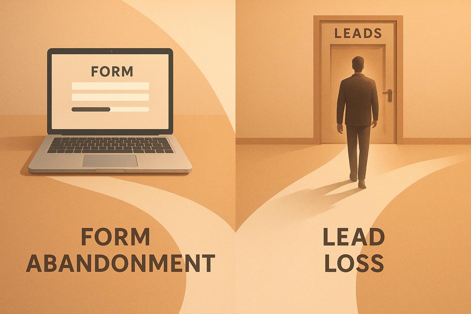
- Recover lost leads: Tools like MagicTag capture partial form data from users who abandon forms, helping you follow up and recover up to 12x more leads.
This guide covers everything you need to know about CRO, from mapping user journeys to optimizing landing pages, reducing form friction, and running effective A/B tests. Whether you're a small business or a growing company, these strategies can help you maximize your website's potential.

CRO Statistics: Conversion Rates and Impact on Business Growth
How to Map and Diagnose Your Conversion Funnel
Map User Journeys and Analyze Traffic Sources
A conversion funnel outlines the path visitors take from landing on your site to completing a desired action, like submitting a form or making a purchase. Think of it as a funnel: it starts broad with many potential customers at the top and narrows to those who actually convert. Mapping this journey helps you track every touchpoint, from the first ad click to the final action - or abandonment.
Start by defining the steps users take on your site. For lead-generation websites, this might include landing on a page, scrolling through content, clicking a call-to-action, and beginning a form. Tools like Google Analytics 4 (GA4) can help you create "Funnel exploration" reports, offering a visual breakdown of each step and highlighting where users drop off. You can also segment traffic by source - whether visitors found you through a Google search, Facebook ad, or email campaign - to see which channels drive the most qualified leads. Once you’ve mapped this journey, quantify each touchpoint to identify problem areas in the funnel.
Identify Key Metrics and Benchmarks
With the journey mapped, it’s time to dig into the numbers. A key metric to track is your conversion rate - the percentage of visitors who complete your desired action. Industry data shows that for lead-generation landing pages, the average conversion rate is 2.35%, but top-performing pages can hit 5.31% or higher. Across industries, the average conversion rate is 5.89%, with the best hitting 11.45% or more.
Another critical metric is the drop-off rate at each stage of the funnel. For example, if 1,000 visitors land on your page but only 300 start filling out a form, a 70% drop-off suggests potential issues with your layout, messaging, or value proposition. Additionally, monitor the form abandonment rate - how many users begin but don’t complete the form. Breaking these metrics down into smaller steps helps you pinpoint the weakest areas of your funnel.
Use Heatmaps and Session Recordings
While numbers provide valuable insights, visual tools can help you see what’s happening on your site. Heatmap tools like Hotjar and Crazy Egg show you where visitors click, how far they scroll, and which areas they ignore. For instance, if users aren’t scrolling far enough to see your form, it might need to be repositioned.
Session recordings take this a step further by capturing individual user sessions. These recordings let you observe moments of hesitation or frustration, like repeatedly clicking a non-functional button or abandoning a form after encountering an issue. These tools reveal friction points that raw numbers alone can’t uncover.
As Nathan Thompson, Revenue-focused Marketing Leader at Copy.ai, wisely points out: "Conversion funnel analysis is not a one-time task - rather, it is an ongoing cycle of continuous improvement."
How to Optimize Landing Pages for Better Conversions
Improve Page Layout and User Experience
Once your conversion funnel is mapped out, the next step is to fine-tune your landing page layout to create a seamless experience for visitors. A clean, simple design with plenty of white space helps keep the focus on your main message and call-to-action (CTA). Here's why it matters: studies show that 70% of consumers prioritize loading speed - a delay of just one second can drop conversions by 7%, while a one-second load time can boost conversion rates up to fivefold.
Use visual hierarchy to guide visitors naturally through your page. Arrange elements by importance, using F-pattern or Z-pattern layouts, which align with how people typically scan web pages. Key elements like your headline, unique value proposition (UVP), and primary CTA should be placed above the fold, ensuring they're immediately visible - especially important since 83% of visits happen on mobile devices. Make sure buttons are easy to tap, keep forms short, and test readability by holding your phone at arm’s length to ensure everything is user-friendly.
Eliminate distractions by removing navigation menus, unnecessary links, pop-ups, and announcement bars. Your landing page should focus on a single, clear conversion goal. Also, make sure the design and messaging are consistent with the ad or traffic source that brought visitors to your page. This kind of alignment builds trust quickly.
Write Clear Value Propositions for U.S. Audiences
With 80% of visitors reading headlines but only 20% engaging with the rest of the content, your headline needs to highlight benefits right away. Swap vague labels like "Advanced Analytics Dashboard" for something more direct, like "Track Which Marketing Campaigns Drive Revenue in Real-Time." Addressing pain points clearly and upfront helps grab attention. Since U.S. audiences appreciate transparency, display pricing in USD if you're offering a SaaS product or subscription. Cutting down your copy by 50% can also increase conversion rates by 30%.
Your CTAs should use action-oriented language. Replace generic phrases like "Submit" with something more compelling, such as "Get Your Free Marketing Guide" or "Start My 14-Day Trial." Position your CTA prominently - ideally above the fold - and repeat it on longer pages to keep it visible throughout.
Build Trust with Social Proof and Security Features
Adding testimonials can increase conversions by 34%, while customer reviews can boost them by up to 270%. Place testimonials or a logo bar close to your CTA to help ease decision-making anxiety. For newsletter sign-ups, use engaging microcopy like "Join 50,000 Accountants - Stay Ahead in Your Field", paired with subscriber testimonials or industry awards.
Use personalized testimonials that include names and photos to make them relatable. Display trust badges, security certifications, and logos of well-known brands you've worked with to enhance credibility. Ensure your site uses an SSL certificate (indicated by "https" in your URL) for added security. Since 92% of consumers hesitate to buy from sites without customer reviews, showcase case studies, star ratings, or even real-time purchase notifications to validate your product or service. These elements can make a huge difference in building trust and driving conversions.
How to Reduce Form Friction and Recover Abandoned Leads
Best Practices for Simple Form Design
Forms can be a major roadblock to conversions if they’re not user-friendly. With first impressions forming in just 50 milliseconds, it’s crucial to keep forms as simple as possible. Stick to the essentials - name, email, and phone number - while cutting out any unnecessary fields. Every extra question increases the likelihood of users abandoning the form.
Inline validation is a must. It helps users instantly see if their input is correct, reducing frustration. For U.S. audiences, format phone number fields to automatically include parentheses and dashes (e.g., (555) 123-4567) and ensure ZIP code fields are clearly labeled for a 5-digit entry. When errors occur, provide clear and specific feedback. Instead of a vague error like "Invalid input", use messages such as "Please enter a valid email address" or "ZIP code must be 5 digits."
For longer forms, break them into smaller, more manageable sections. Begin with simple, low-pressure fields like "First Name" before moving on to more sensitive questions, such as financial details. This step-by-step approach helps users feel less overwhelmed and builds their confidence as they progress through the form.
Reduce Form Anxiety
Concerns about privacy and data usage often deter users from completing forms. A short, reassuring privacy statement placed directly below the form can help ease these fears. For example: "We’ll never share your information. Unsubscribe anytime." For fields requesting sensitive details, add a brief explanation like, "We’ll only use your phone number to contact you if there’s an issue with your order" or "This is required to calculate shipping."
Show users that their data is secure by including visible security indicators. Display your SSL certificate (the padlock icon in the browser) and, if collecting payment information, include trust badges from well-known providers. Keep the tone of your form friendly and non-judgmental. Avoid language that feels pushy or pressures users to submit before they’re ready.
When users feel secure and respected, they’re far more likely to complete your form, making trust a key part of your optimization strategy.
Recover Abandoned Leads with MagicTag
Even with a well-optimized form, some users will still abandon it. That’s where MagicTag comes in. This tool captures input data in real time, even if users don’t hit “Submit.” By doing so, MagicTag helps you identify up to 12x more leads compared to traditional form tracking.
Once MagicTag collects this data, you can use its webhook and API integrations to automatically follow up through your CRM. For instance, if a user enters their email but leaves your pricing page form incomplete, you can send a follow-up email within the hour offering assistance or addressing common concerns. The tool’s real-time dashboard provides insights into which forms have the highest abandonment rates, allowing you to focus your efforts where they’re needed most.
MagicTag is easy to set up - it works on any website, takes just minutes to install without requiring a developer, and complies with GDPR and LGPD regulations. Its seamless integration with your CRM ensures you can take immediate action to recover lost leads and improve conversion rates.
How to Run Experiments to Improve CRO
A/B Testing Process for Small Businesses
A/B testing is a straightforward way to use data to improve your conversion rates. Start by gathering both quantitative data (like bounce rates from Google Analytics) and qualitative insights through tools like heatmaps and session recordings. These will help you identify where users are dropping off.
Once you’ve found an issue, create a hypothesis. For example, you might predict that switching your call-to-action (CTA) from "Learn More" to "Get Started Free" will increase form submissions. Then, split your traffic between the original version (control) and the new variation. Let the test run until the results are statistically reliable. During this process, focus on tracking key metrics to see how your changes affect performance.
For quicker results, prioritize testing high-impact elements like headlines, CTAs, or form lengths. Tools like MagicTag can also help you identify fields in your forms that lead to high abandonment rates, so you can adjust them accordingly.
Track Metrics and Avoid Common Mistakes
Start by defining a primary metric, such as form submissions or cost per lead. To get a fuller picture, track secondary metrics like time spent on the page or bounce rates.
One major mistake to avoid is ending a test too soon. Even if one variation seems to be performing better early on, you need to wait for statistically significant results before drawing conclusions. Another common error is testing too many elements at once (unless you’re running a multivariate test). Testing multiple changes simultaneously makes it hard to pinpoint which specific adjustment caused the improvement.
Build a CRO Roadmap
Once you’ve run your tests and analyzed the metrics, it’s time to create a focused CRO roadmap. Rank your experiments by their potential impact and how easy they are to implement. Start with simpler changes that can deliver quick results, like tweaking button colors or improving CTA copy. Save more complex experiments, such as redesigning your checkout flow, for later when you have more data to guide you.
MagicTag’s real-time dashboard can be a valuable resource here. For instance, if the dashboard shows that users frequently abandon a form at a specific step, you might test making that field optional or adding reassuring text to reduce friction. Make it a habit to document your test results. This way, you’ll build a knowledge base that can guide future CRO efforts and scale your improvements over time.
sbb-itb-77d5bc3
How to Measure and Scale CRO Success
Attribute Revenue Gains to CRO Changes
Connecting revenue gains to your CRO (Conversion Rate Optimization) efforts is crucial for understanding what’s working. By linking every step of the customer journey to your bottom line, you can pinpoint which CRO changes are driving revenue. This is especially helpful for businesses with complex sales cycles.
Start by integrating your website analytics with your CRM. This combination allows you to track visitors as they turn into paying customers and calculate the revenue they generate. For instance, if MagicTag helps recover leads that eventually convert, you can quantify the revenue impact. CRO essentially boosts the value of your existing traffic, amplifying your overall marketing ROI.
These revenue insights provide a foundation for precise measurement using MagicTag’s analytics.
Use MagicTag Metrics to Measure Success
MagicTag’s metrics take revenue attribution a step further by offering deeper insights into your CRO performance. A key metric to monitor is the gap between identified users and completed form submissions. If MagicTag captures a large number of leads but only a fraction complete the form, it signals an opportunity to improve your form's design or process.
Dive into abandonment and recovery rates to figure out where users are dropping off. This data can guide your follow-up strategies. Additionally, check performance across devices. For instance, if mobile users are abandoning forms more frequently than desktop users, it might be time to optimize the mobile experience.
Scale Winning Strategies for Different Audiences
Once you’ve identified what works, it's time to fine-tune those strategies for specific audiences. Use your data to segment performance by audience type, device, and traffic source. For example, if mobile visitors have higher bounce rates than desktop users, focus on improving the mobile experience. Similarly, if one traffic channel consistently delivers better conversions, consider allocating more resources to that channel.
Before rolling out successful strategies broadly, test them with new audience segments. A call-to-action that resonates with returning customers might not work as well for first-time visitors. MagicTag’s data can help you identify which channels bring in the most high-value leads, so you can tailor your content and forms to suit each group. Keep a record of what works for different audiences, making it easier to replicate success across similar segments.
Conversion Rate Optimization Masterclass (Full Course)
Conclusion
Conversion Rate Optimization (CRO) isn't a one-and-done task - it’s a continuous process that evolves with user behavior, market shifts, and advancements in technology. As Optimizely aptly puts it:
"In digital marketing, there is always room for improvement when it comes to website conversion rate, and the best companies are constantly iterating and improving their sites and apps to create a better experience for their users and grow conversions".
Even a modest 0.5% boost in conversion rates can translate into meaningful revenue growth.
By mapping your conversion funnel, fine-tuning landing pages, minimizing form friction, running thoughtful experiments, and analyzing the results, you lay the groundwork for success. Tools like MagicTag are a game-changer in this process, capturing real-time user data as visitors fill out forms. This feature empowers small and medium businesses to recover abandoned leads and significantly increase their lead volume. When paired with the strategies outlined here, MagicTag provides the insights needed to build a reliable and effective conversion framework.
It's important to embrace the iterative nature of CRO. While only 12% of experiments result in winning outcomes, every test - successful or not - offers valuable lessons about your audience. As Optimizely reminds us:
"Experimentation is about learning. The only way your optimization efforts 'fail' is if you fail to learn from it".
For small and medium businesses, CRO is a cost-effective way to maximize the value of your existing traffic without increasing ad spend. Regular reviews, heatmap analysis, and MagicTag's metrics allow you to continuously enhance your performance. Think of your website as a living, breathing asset - it should grow and adapt alongside your customers' needs.
Start small. Pick one strategy from this guide, test it thoroughly, and build on the results. Whether it’s recovering abandoned leads with MagicTag’s real-time capture or tailoring your mobile experience based on device-specific data, each improvement adds up. Over time, these incremental changes will compound, driving sustainable growth and keeping your business ahead of the curve.
FAQs
How can Conversion Rate Optimization (CRO) help improve my website's performance without increasing traffic?
CRO, or Conversion Rate Optimization, is all about getting more value from the visitors already coming to your website. By refining user experiences - whether that’s making navigation smoother, simplifying the checkout process, or crafting more effective calls-to-action (CTAs) - you can guide more users toward taking actions like completing a purchase or signing up for a service.
A big part of this process is spotting and fixing obstacles that might frustrate visitors, such as confusing layouts or pages that take too long to load. Tools like heatmaps and A/B testing come in handy here. They provide insights into how users interact with your site and let you experiment with design tweaks. The goal? To fine-tune your site for better conversions - without needing to bring in more traffic.
What are the best ways to design forms that keep users from dropping off?
To keep users engaged and reduce drop-offs, focus on making your forms as simple and intuitive as possible. Start with clear, straightforward field labels and only request the information that's absolutely necessary - anything extra can frustrate users and lead them to abandon the form.
Add inline validation so users can catch and fix errors as they type. This not only saves time but also makes the process feel smoother. And don't forget about mobile! Ensure your forms are fully optimized for smaller screens, so users can easily complete them on any device.
For longer forms, break them into smaller, digestible steps and include a progress bar to show users how far along they are. This helps prevent them from feeling overwhelmed. Keep layouts clean and avoid cluttering the page with unnecessary fields. Finally, test your forms regularly to identify any issues or barriers that might discourage users. Even small tweaks can significantly boost completion rates and create a better user experience.
How does MagicTag help recover leads that were abandoned?
MagicTag steps in to rescue abandoned leads by studying user behavior and delivering tailored follow-up messages designed to bring them back. These messages are crafted to motivate users to complete pending actions, like finalizing a purchase or filling out a form.
By identifying possible obstacles and using data-backed strategies, MagicTag helps ensure your leads are guided thoughtfully, improving conversions and enhancing the overall success of your website.