Conversion Rate Optimization (CRO) is about turning more visitors into customers without increasing traffic. Even a small improvement in your conversion rate can significantly impact revenue. Here’s what you need to know:
- Simplify Form Fields: Too many fields lead to abandonment. Trim them down and use features like autocomplete and mobile-friendly designs.
- Reduce Friction: Slow pages, confusing navigation, or unexpected costs drive users away. Speed up load times and simplify checkout steps.
- A/B Testing: Test headlines, CTAs, and layouts to find what works best. Use analytics to uncover problem areas.
- Build Trust: Add reviews, security badges, and testimonials to make users feel secure about sharing their details.
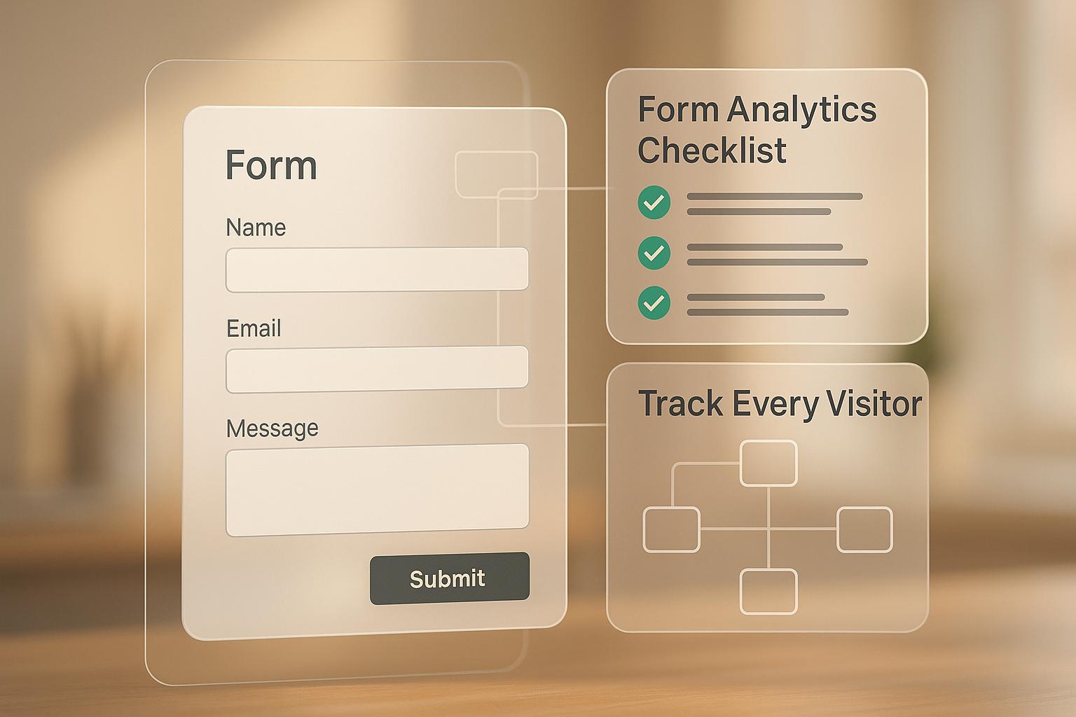
- Recover Lost Leads: Use tools like MagicTag to collect partial form data and follow up with potential customers.
These strategies work for any business size and can lead to measurable improvements in your conversion rates. Start small, track results, and refine as needed.
15 Conversion Rate Optimization Tips That Will 2x Your Sales Overnight
1. Reduce and optimize your form fields
Too many form fields can seriously hurt your conversions. Research shows that 27% of users abandon forms that are too long. On average, e-commerce checkouts include 11.8 fields, but only about eight are truly necessary.
The results of trimming down forms can be eye-opening. Back in 2011, Expedia boosted profits by $12 million by removing just one non-essential field from their checkout process. Similarly, Qualicorp, a financial site managing healthcare plans, saw a nearly 17% increase in sign-ups simply by cutting redundant fields and sticking to the essentials.
Impact on conversion rates
Every extra field increases the risk of losing users. Tammy Duggan-Herd, PhD, Director of Marketing at Campaign Creators, sums it up perfectly:
"Every step you add increases the user's likelihood to abandon."
In fact, 18% of users have abandoned purchases because the checkout process was too lengthy or complicated.
How to streamline your forms
Start by asking yourself: Is this field absolutely necessary? The information you request should match the value of what you're offering. For example, if you're giving away a free e-book, you probably only need basic details like first name, last name, email, and maybe a company name. Skip asking for a phone number unless it's critical.
To make things even easier for users:
- Enable autocomplete to speed up data entry.
- Use inline validation to catch errors immediately.
- Ensure your forms are mobile-friendly and function smoothly across all devices.
Works for businesses of any size
Form optimization is accessible to everyone - no fancy tools or advanced tech skills required.
For small businesses, a simple start might be removing one or two unnecessary fields and tracking the results. Larger companies can take it further with the "breadcrumb technique", which breaks forms into smaller, single-question steps to avoid overwhelming users. You can also tailor forms based on responses - like skipping apartment-related fields if the user selects "house" as their residence type.
These adjustments make it easier for users to complete forms, helping you build a smoother path to conversions.
2. Remove friction from your conversion funnel
Friction slows down or even stops users from converting. Things like confusing navigation, slow-loading pages, or unexpected costs at checkout can quickly turn potential customers away. Did you know that around 69% of shoppers abandon their carts, and 87% leave due to a complicated checkout process?.
Friction isn’t just annoying - it costs you money. For example, if a page takes three seconds to load, users are 32% more likely to leave. Stretch that to six seconds, and the bounce rate skyrockets by 106%. And every extra second of load time cuts your conversion rate by 12%. A simple tweak like PearlsOnly’s decision to remove unnecessary checkout details and focus on product information and calls-to-action (CTAs) boosted their revenue by 10%. They discovered the issue through heatmaps that highlighted where visitors were dropping off. These examples show how friction directly undermines your ability to convert visitors into customers.
Impact on conversion rates
Here’s the bottom line: eliminating friction means more conversions. Take Morningstar, a real estate company, as an example. They swapped out their mobile CTA from "Contact us" to "Inquire now", creating a sense of urgency and clarity. The result? A 44.11% increase in clicks.
Interplay Learning offers another powerful example. Using heatmaps and session recordings, they pinpointed obstacles on their demo page. After testing new layouts and hiding visible pricing, they saw conversions jump by 183%. Basic plan clicks increased from 12% to 25%, Teams plan clicks rose from 8% to 20%, and Enterprise plan clicks tripled from 1% to 3%.
Ease of implementation
The good news? You don’t need a big budget to start removing friction. Begin with simple steps like optimizing images, scripts, and enabling caching to speed up load times. Streamline navigation so users can easily find what they’re looking for. Even small changes, like hiding coupon fields behind links, can keep users focused during checkout.
For mobile users - who now account for nearly half of web traffic (49.78%) - ensure that buttons are easy to tap and forms work seamlessly across devices. Offering guest checkout options instead of requiring account creation and supporting multiple payment methods, including digital wallets, can also make a big difference.
Scalability for different business sizes
Friction removal works whether you’re a small business or a large company. If you’re just starting out, focus on one critical page - like your checkout or lead capture form - and make straightforward improvements like speeding up load times or reducing distractions. Larger businesses, on the other hand, can leverage tools like heatmaps, session recordings, and A/B testing to uncover friction points across multiple pages and customer segments.
Pamela Bump, Content Growth Team Manager at HubSpot, shares this advice:
"Take advantage of a heat mapping and scroll mapping tool to get a better understanding of user behavior on your web pages. These tools can provide insights that help you identify optimization and testing opportunities."
The key is to test and refine changes based on how real users interact with your site. Start small and scale up as your needs grow.
3. Use A/B Testing and Analytics Tools
A/B testing and analytics tools take the guesswork out of improving your website by providing concrete data. These tools pinpoint where visitors drop off and reveal conversion rates. Meanwhile, visual tools like heatmaps, scroll maps, and session recordings help you see exactly how users interact with your pages.
When you combine these methods, you get a clear picture of your site's performance. Analytics identify problem areas, and A/B testing allows you to directly compare different design elements to see which one performs better. This evidence-based process ensures that every change you make is backed by solid data, reducing the risk of costly errors and leading to smarter decisions that improve conversions.
Impact on Conversion Rates
Testing elements like headlines, button colors, form layouts, and CTAs can have a noticeable effect on your conversion rates. Using the PIE framework - Potential, Importance, Ease - helps you prioritize changes that will make the biggest difference. Start by analyzing metrics like conversion rates, bounce rates, click-through rates, and average order values. Then, layer in qualitative insights from surveys and customer feedback to get a more complete understanding. This balanced approach helps you make smarter, more impactful updates.
Ease of Implementation
Getting started with A/B testing and analytics doesn't have to be complicated. Free tools like Google Analytics and simple heatmap software make it easy to dive in. Focus on a high-traffic or critical conversion point, develop a clear hypothesis, and test one element at a time. For example, try reducing the number of form fields, adding inline validation, or tweaking button text to see what resonates most with your audience. Testing one change at a time ensures you can pinpoint exactly what's driving results.
Scalability for Different Business Sizes
A/B testing works for businesses of all sizes. If you're just starting out, focus on optimizing key pages like your homepage, pricing page, or lead capture form using free tools. As your business grows, you can scale your efforts to test multiple page variations, segment your audience, and even personalize the user experience. Each experiment builds on the last, helping you refine your approach and continuously improve conversion rates. Over time, these insights pave the way for even greater success by enhancing trust and tailoring experiences to your audience.
sbb-itb-77d5bc3
4. Add Trust Signals and Personalization to Forms
Once you've fine-tuned your forms through testing and analytics, it's time to focus on building trust with your users. Adding trust signals - like customer reviews, security badges, and certifications - can make a huge difference in how comfortable people feel about sharing their information. This is especially important on checkout pages, where trust is critical. In fact, 18% of consumers have abandoned a purchase simply because they didn’t trust the site with their credit card details. It’s not just about technical security; users often rely on visual cues to decide if a page feels trustworthy, making these signals crucial for increasing conversions.
The numbers speak for themselves: visitors who engage with reviews are 58% more likely to convert into paying customers. Testimonials alone can increase conversion rates by 34%. For example, LKR Social Media tested using a testimonial as the headline for their email signup form and saw a 24.31% boost in conversions. In some cases, user-generated content has even led to a staggering 200% increase in conversion rates.
Impact on Conversion Rates
Placing trust signals strategically near your forms and calls-to-action can provide instant reassurance to users. Think about showcasing customer ratings, review counts, and security badges. For example, the Norton certification has been identified by Baymard Institute as one of the most effective seals for checkout pages. Bridal brand Revelry leveraged Yotpo's Smart Filters to let customers sort reviews by fit, quality, and style, resulting in a 7.6% widget conversion rate. Similarly, Dakine found that customers who interacted with user-generated content were 152% more likely to convert.
Ease of Implementation
Getting started with trust signals doesn’t have to be complicated. Begin by adding SSL certificates (you’ll know them by the "https" in your URL), displaying recognizable payment logos, and placing real customer testimonials near your forms. To encourage reviews, send follow-up reminders to existing customers. On checkout pages, position security badges and trust indicators where they’ll be most visible. Thoughtful placement of these elements can make a big difference in building user confidence.
Scalability for Different Business Sizes
Whether you’re running a small business or managing a large operation, trust signals can work for you. Start with the basics - testimonials and SSL certificates - and gradually scale up. Larger businesses can take it further by using dynamic personalization and conducting extensive A/B testing, which has been shown to improve conversion metrics by 41%.
5. Capture Abandoned Leads with MagicTag
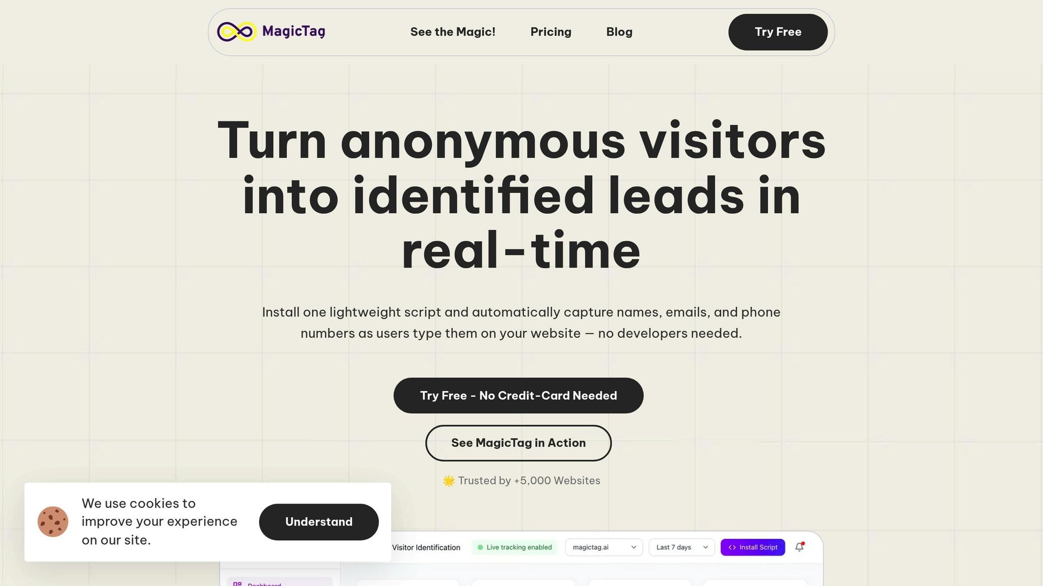
A common challenge with online forms is that many visitors leave before hitting the submit button, leaving valuable lead data behind. MagicTag solves this issue by capturing user data in real time as they type. Even if someone abandons the form halfway, MagicTag collects their contact information and seamlessly integrates it into your CRM using webhooks and APIs. This allows you to follow up with personalized emails or retargeting campaigns, helping you reconnect with potential leads and improve your conversion rates.
Impact on Conversion Rates
MagicTag has the potential to uncover up to 12 times more leads compared to traditional forms. For instance, if your current setup captures 100 leads a month, MagicTag can dramatically increase that number, giving your business a significant boost in lead generation and overall conversion potential.
Easy to Set Up
Installing MagicTag is straightforward. It works with a lightweight code snippet, so you don’t need a dedicated development team to get started. Plus, it’s compliant with privacy regulations like GDPR and LGPD, ensuring your data practices stay above board. Once installed, you’ll have access to a real-time dashboard that tracks user interactions with your forms - even for incomplete submissions. The free plan supports up to 1,000 users per month, making it a risk-free way to test how MagicTag can impact your conversions.
Flexible for Any Business Size
MagicTag is designed to grow with your business. Small businesses can start with the free plan ($0/year), while companies with growing traffic can opt for the Starter plan at $19 per month, which supports up to 10,000 users. For businesses handling higher traffic - 50,000+ visitors monthly - the Business plan at $99 per month or the Enterprise plan at $299 per month offers dedicated infrastructure and custom integrations. This flexible pricing ensures you only pay for what you need as your lead volume scales. MagicTag’s adaptable approach makes it a smart solution for businesses of all sizes, setting the stage for impressive CRO results in future analyses.
Before and After: CRO Results Comparison
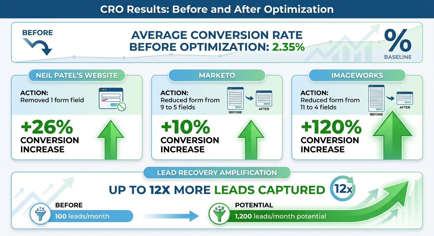
CRO Statistics: Form Optimization and Conversion Rate Impact
Before diving into effective Conversion Rate Optimization (CRO), the average conversion rate sits at around 2.35%. But with a few smart tweaks - like refining form fields, minimizing friction, and testing different variations - businesses have achieved impressive improvements.
Take these examples: Neil Patel's website saw a 26% jump in conversions just by removing a single form field. Marketo trimmed their form from nine fields to five and enjoyed a 10% boost in conversions. And ImageWorks? They streamlined their form from eleven fields to four, leading to an incredible 120% increase in conversions.
But that's not all. Recovery solutions can amplify these results even further. Tools like MagicTag capture user inputs in real time, generating up to 12 times more leads than standard forms. For instance, if your site typically collects 100 leads each month, these strategies could potentially bring in up to 1,200 leads.
These optimizations don’t just improve conversion rates - they also reduce friction for users, lower customer acquisition costs, and deliver a better return on your marketing investment. It’s a win all around.
Conclusion
Boosting your conversion rate doesn’t mean tearing down your entire website. The five strategies we’ve explored - streamlining form fields, cutting out friction, running A/B tests, adding trust signals, and re-engaging abandoned leads - can work together to guide visitors smoothly toward becoming customers. Each method tackles specific obstacles users face, and when combined, they can significantly impact your revenue.
These steps provide a strong starting point for ongoing improvements. Conversion rate optimization (CRO) isn’t a one-and-done effort - it’s a continuous cycle of testing, learning, and refining. As user behavior and market dynamics shift, regular testing becomes crucial. Even a modest 1–2% increase in conversion rates can add up over time, leading to noticeable revenue growth.
Begin by trying out one or two of these strategies. Track your results, analyze the data, and adjust based on what works. Use metrics like conversion rates and drop-off points to guide your decisions and uncover what resonates with your audience.
Keep in mind that most websites see conversion rates between 2% and 4% across industries. With steady, data-driven optimization, you can aim to exceed these averages and achieve even greater success.
FAQs
What are the best ways to reduce friction in my conversion funnel?
To make your conversion funnel smoother, focus on making things easier for users and refining their experience. Start with the basics: simplify the checkout process by cutting down unnecessary steps or form fields, and make sure your site loads fast - no one likes waiting.
Other essentials? Clear navigation and a mobile-friendly design ensure users can move around effortlessly. Adding trust elements like secure payment badges can reassure visitors they’re in safe hands. On top of that, personalized content and a layout that feels intuitive can help guide users seamlessly through the funnel, clearing the way for better conversion rates.
How can I use A/B testing to boost my website's conversion rates?
A/B testing can be an excellent way to boost conversions, but it works best when approached thoughtfully. Focus on testing just one variable at a time - like a headline, button color, or page layout - to pinpoint exactly what's driving changes. Set a specific, measurable goal (like increasing sign-ups or purchases) so you can clearly evaluate whether the change is effective. And don’t rush - let the test run long enough to collect enough data for reliable results.
After analyzing the outcome, apply the winning variation and move on to test other elements. This step-by-step approach helps fine-tune your strategy over time. Gathering user feedback along the way can also reveal new areas to tweak and improve. A/B testing isn’t a one-and-done process; it’s an ongoing method for making smarter, data-backed decisions that improve user experience and deliver better outcomes.
How does MagicTag help recover leads that abandon their actions?
MagicTag works to bring back abandoned leads through behavior-based notifications and tailored onsite campaigns. These features act as subtle nudges, prompting visitors to finish what they started - whether that’s completing a purchase, signing up, or filling out a form.
By aligning with user intent and smoothing out potential obstacles, MagicTag doesn’t just boost conversions. It also keeps bounce rates in check, making it easier to keep your audience engaged and moving toward the desired outcome.