68% of online forms are abandoned, costing businesses leads and sales. Why? Forms are often too long, unclear, or frustrating to use. But here’s the good news: small changes can make a big difference.
Key Takeaways:
- Top reasons for abandonment: Security concerns (29%), form length (27%), and required fields like phone numbers (37% drop in completions).
- Better design works: Short forms (3–5 fields), single-column layouts, and optional phone fields improve completion rates.
- Tools like MagicTag: Recover up to 12x more leads by saving user data as they type - even if they don’t hit submit.
Want fewer abandoned forms? Simplify your design, build trust, and use smart tools to recover lost leads. Let’s dive deeper into how you can fix this.
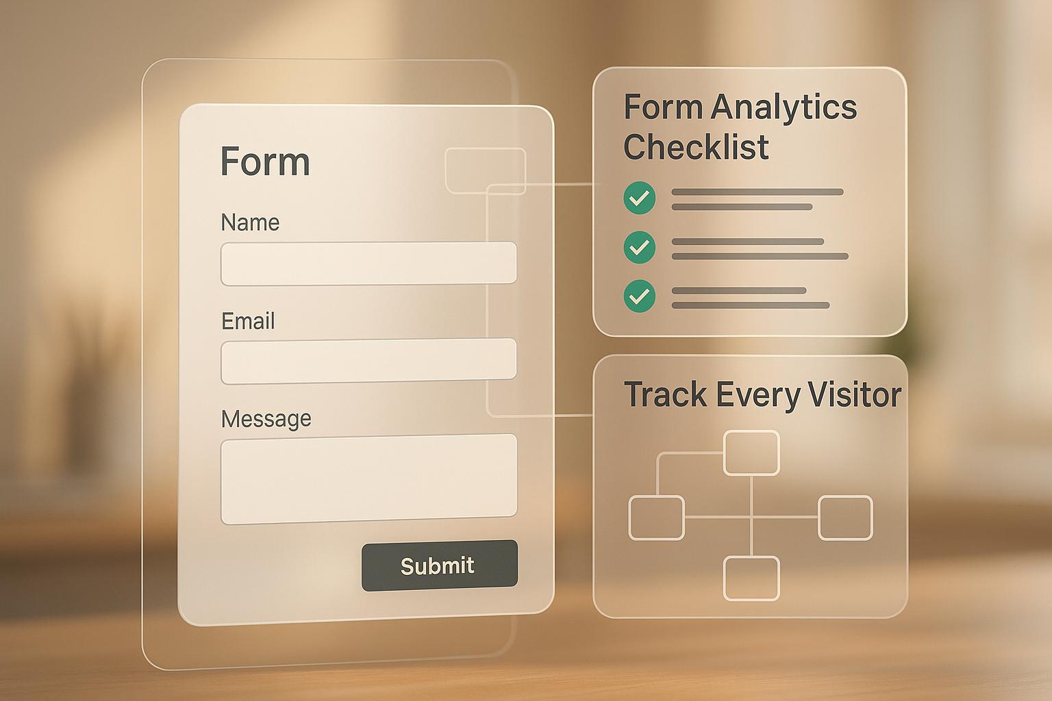
How to Measure and Decrease Form Abandonment
Why Users Abandon Forms Before Submitting
Form Abandonment Statistics: Rates by Industry, Device, and Top Reasons Users Quit
Form Abandonment Rates by Industry and Device
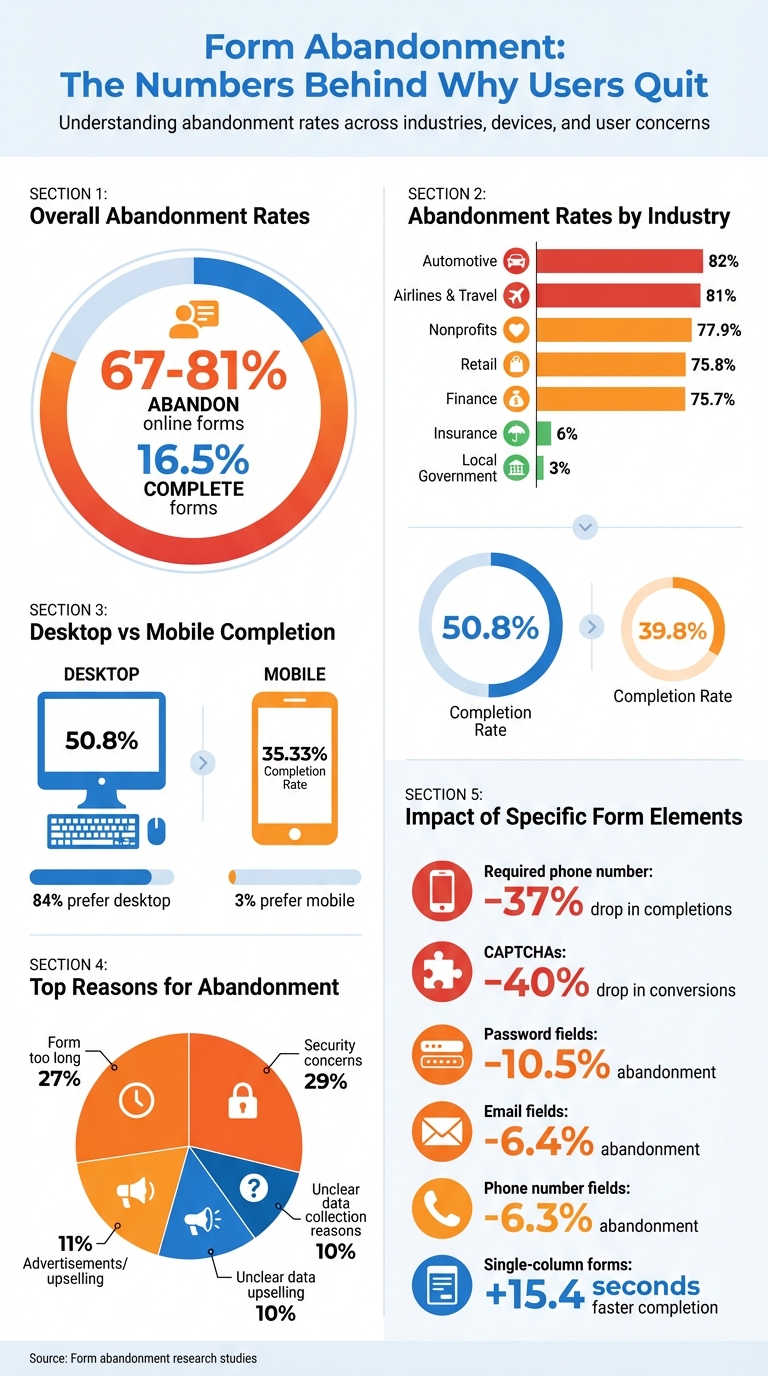
Across nearly every industry, form abandonment is a persistent challenge. Studies reveal that between 67% and 81% of users abandon online forms, with only 16.5% completing them.
The abandonment rate varies significantly by industry. For example, airlines and travel companies face an alarming 81% abandonment rate, while the automotive sector sees an even higher rate at 82%. Other industries aren't far behind - finance (75.7%), retail (75.8%), and nonprofits (77.9%) all experience substantial losses. On the other hand, local government forms have a much lower abandonment rate of just 3%, and insurance forms follow closely at 6%. This disparity is likely because these forms often involve essential services, leaving users with few alternatives.
Device usage also plays a role in form completion. Desktop users complete forms at a higher rate of 50.8%, compared to just 35.33% for mobile users. Interestingly, 84% of users prefer desktops, while only 3% favor mobile devices for filling out forms. These statistics underscore the importance of understanding why users abandon forms in the first place.
Top Reasons People Leave Forms Incomplete
One of the biggest reasons users abandon forms is security concerns, with 29% worrying about how their data will be used. Form length comes in as a close second, cited by 27% of users. Other factors include advertisements or upselling attempts (11%) and unclear reasons for data collection (10%).
"As humans, we all hate filling out forms. I think forms are friction." – Stu Collett, Founding Partner and Principal Design Director, Super User Studio
Certain design choices can also have a huge impact on completion rates. For instance, requiring a phone number can reduce completion rates by 37%, unless the field is marked optional. Similarly, CAPTCHAs can lower conversions by 40%. Even the layout matters - single-column forms are completed on average 15.4 seconds faster than multi-column ones.
Individual form fields also play a role in abandonment. Password fields drive away 10.5% of users, while email address and phone number fields cause 6.4% and 6.3% to leave, respectively. These statistics show how even small inconveniences can significantly impact user behavior, leading to lost leads and missed opportunities.
How to Design Forms That People Actually Complete
Form Design Rules That Increase Completions
If you want people to actually finish filling out your forms, keeping them short is key. Aim for just 3–5 fields - any more than that, and you risk losing potential completions. Studies show that every extra field can drop conversion rates by 5% to 10%, and when forms exceed 8 fields, completion rates often sink below 10%.
Stick to a single-column layout to make forms easier to read and process. This approach matches natural reading patterns and reduces mental effort. Plus, single-column forms are completed 15.4 seconds faster than their multi-column counterparts.
When it comes to phone numbers, make them optional unless absolutely necessary. Forcing users to enter a phone number can lead to 37% of them abandoning the form - unless it’s clearly marked as optional.
Another small but powerful tweak? Use clear, action-oriented button labels. Phrases like “Create My Account” perform better than generic options like “Submit,” boosting conversions by 3%. And definitely skip “Reset” or “Clear” buttons - these can accidentally erase progress and frustrate users.
For longer forms, consider breaking them into multi-step formats with progress indicators. This structure makes the process feel less overwhelming, especially for mobile users. In fact, multi-step forms have been shown to convert 87% better than single-step forms when tackling complex tasks.
Lastly, make the experience even smoother by incorporating real-time feedback and auto-fill features.
How Real-Time Validation and Auto-Fill Help Users
Real-time validation provides instant feedback as users fill out a form, helping them fix errors on the spot. This feature, combined with clear visual cues like green checkmarks or error messages, reduces mistakes by 22% and speeds up completion times by 42%. It’s a simple way to build user confidence and lower frustration.
Meanwhile, auto-fill features cut down on manual typing, which is especially helpful on mobile devices. By using browser auto-fill or predictive text for things like addresses and payment details, you make the process faster and far less tedious.
When forms follow basic usability principles, they’re 78% more likely to be submitted error-free on the first try, compared to just 42% for poorly designed forms. Small changes can make a big difference in how users interact with your forms.
sbb-itb-77d5bc3
How MagicTag Captures Leads from Abandoned Forms
What MagicTag Does and How It Works
MagicTag helps you collect user information as they type, even if they never hit the submit button. By adding a simple JavaScript snippet to your site, MagicTag tracks form fields in real-time. As soon as someone starts typing their name, email, or phone number, the tool syncs each keystroke with your server.
Setting it up is quick and doesn’t require a developer. Since it captures data instantly, you won’t lose potential leads if someone closes their browser or leaves the page midway through filling out a form. This complements existing strategies like auto-fill and real-time feedback, ensuring fewer leads slip through the cracks. Essentially, it creates a safety net for your lead generation efforts.
Why Businesses Use MagicTag for Lead Recovery
Thanks to its real-time data capture, MagicTag can identify up to 12x more leads compared to relying only on submitted forms. This means you can reconnect with users who showed interest but didn’t complete the process.
MagicTag integrates smoothly with tools you’re already using. It works with CRMs like HubSpot, ActiveCampaign, and RD Station, as well as analytics platforms like Google Analytics, Hotjar, and Mixpanel. These integrations allow you to feed better data into your remarketing campaigns and automation workflows, helping to turn abandoned leads into paying customers.
It’s also compliant with GDPR and LGPD regulations, so you can collect data responsibly. To stay within legal boundaries, you’ll need to include a clear privacy policy link on your forms and, where required, add a GDPR agreement field. These steps not only keep you compliant but also build trust with your users.
MagicTag Plans and Pricing
| Plan | Price | Users/Month | Key Features |
|---|---|---|---|
| Free | $0/year | 1,000 users | Real-time dashboard, basic webhook, email support |
| Starter | $19/month | 10,000 users | Full API + webhook, CRM integrations, priority support |
| Business | $99/month | 50,000 users | High-volume pipelines, advanced filtering + segmentation, SLA support |
| Enterprise | $299/month | 50,000+ users | Dedicated infrastructure, custom integrations, premium support |
The Free plan is a great way to try out MagicTag and see how it improves your lead recovery. As your website traffic grows, you can upgrade to paid plans that offer more advanced features like segmentation and premium support, ensuring the tool scales with your needs.
Conclusion: Fix Form Abandonment and Recover More Leads
Form abandonment doesn't have to spell lost revenue. With high abandonment rates, even small tweaks can make a big difference. Start by simplifying your forms: stick to single-column layouts, enable autofill to save users time, and use real-time validation to catch errors as they type. These simple adjustments can cut form completion time by as much as 42%.
Capture contact details right at the beginning. Adding an email or phone field early ensures you can follow up with the 19% of users who are open to returning if you reach out. By prioritizing these fields before asking for more sensitive information, you'll still have a way to reconnect, even if they abandon the form later.
Build trust with visible SSL badges and clear privacy links. At the same time, consider removing CAPTCHAs, as they can cause a steep 40% drop in conversions.
Pairing these design improvements with smart recovery tools takes your strategy to the next level. Tools like MagicTag can capture data in real time as users type, helping you identify up to 12x more leads compared to depending solely on completed submissions. Keep testing your changes, analyzing where users drop off, and refining each element to recover leads that might otherwise disappear.
Sometimes, a single extra field or a well-timed follow-up can turn a lost lead into a new customer. Start improving your forms today to seize those opportunities.
FAQs
How can I prevent users from abandoning forms on my website?
Form abandonment is a common issue, often caused by factors like overly lengthy forms, unclear error messages, or worries about data security. To tackle this, here are some practical ways to improve the user experience:
- Keep it simple: Stick to asking for only the most necessary information. If your form is long, break it into smaller, more manageable steps to prevent overwhelming users.
- Establish trust: Include security badges, SSL padlock icons, and a straightforward privacy statement to reassure users about how their information will be handled.
- Provide real-time feedback: Use real-time validation to flag errors as users fill out the form. For example, display messages like, “Please enter a valid email address” or “ZIP code must be 5 digits.”
- Make it mobile-friendly: Ensure your forms are fully responsive and easy to use on mobile devices. Features like larger tap areas and context-specific keyboards (e.g., numeric keyboards for phone numbers) can make a big difference.
- Reduce unnecessary barriers: Avoid visible CAPTCHAs when possible. Instead, use alternatives like invisible reCAPTCHA or honeypot fields that don’t interrupt the user’s flow.
By focusing on these adjustments and testing changes with tools such as heatmaps or A/B testing, you can boost form completion rates and recover leads that might otherwise be lost.
What are the best ways to improve form design and reduce abandonment?
The secret to reducing form abandonment lies in making the process simple and user-friendly. Overly long or complicated forms can intimidate users, so aim for a single-column layout, use clear and straightforward labels, and eliminate any fields that aren’t absolutely necessary. If your form spans multiple steps, include a progress indicator to show users how far along they are - this keeps them motivated to finish.
Equally important is building trust and minimizing friction. Reassure users by displaying security badges and privacy statements, letting them know their data is safe. Incorporate real-time error validation to help users correct mistakes as they go, and enable auto-fill to make the process quicker and easier. Don’t forget to ensure your form is mobile-friendly - a responsive design with touch-friendly fields is crucial, as poor mobile experiences often lead to users giving up.
Lastly, prioritize visual clarity. Use white space to create a clean layout, emphasize key buttons, and steer clear of technical jargon. A well-designed, intuitive form doesn’t just look good - it makes the process smoother and can dramatically boost completion rates.
How does MagicTag help recover leads from incomplete form submissions?
MagicTag simplifies the process of recovering leads from abandoned forms by tracking user interactions in real time. It captures the partial information users enter before leaving, giving you insight into where they stopped and what details they provided. This means even incomplete submissions can become potential leads.
The platform goes a step further by enabling personalized follow-ups. You can send tailored emails or retargeting messages based on the data prospects shared. On top of that, MagicTag’s analytics tools pinpoint trouble spots in your forms. Whether it’s simplifying overly complicated fields, adding inline validation, or enabling auto-fill, these insights help you reduce friction and make your forms more user-friendly.
By turning abandoned forms into opportunities, MagicTag helps you recover lost leads and improve your conversion rates.