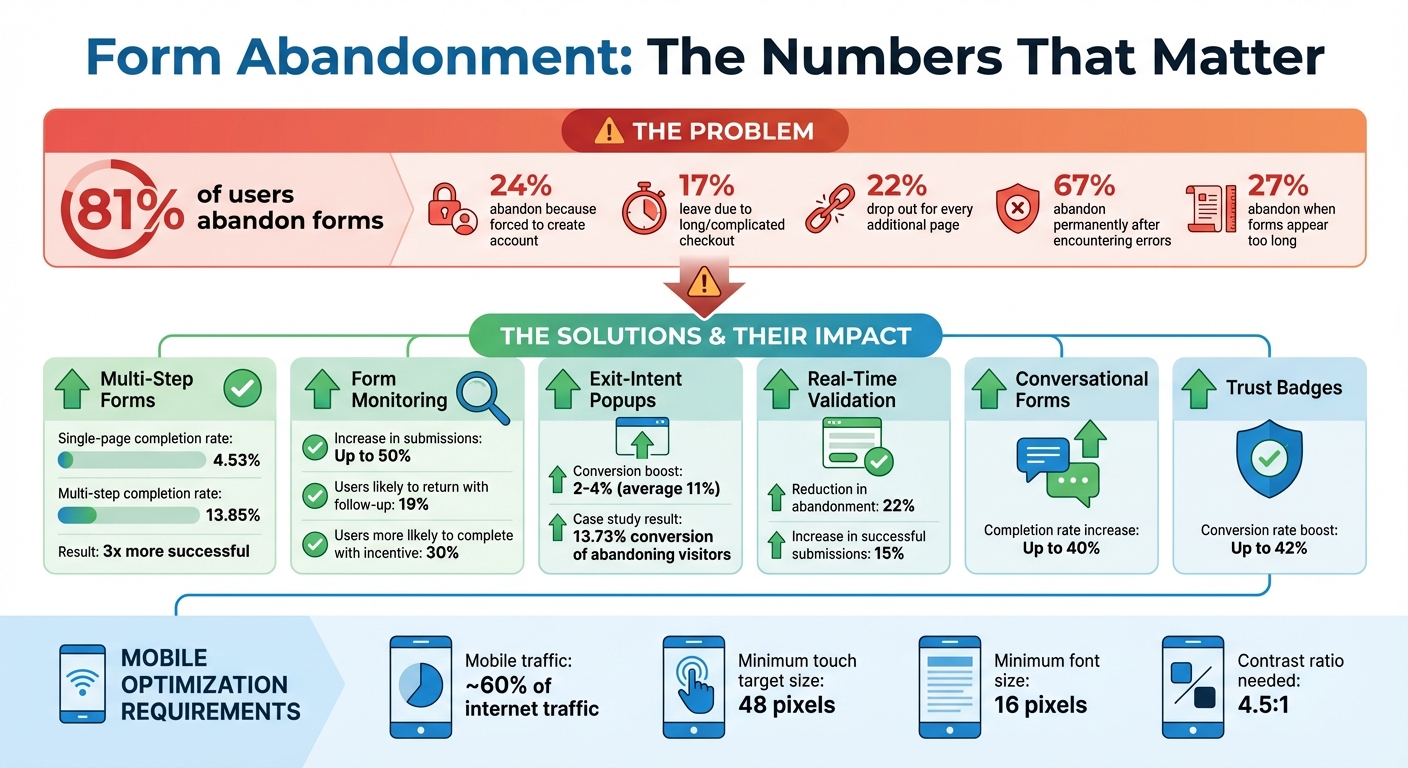
81% of users abandon forms. Why? Frustration, mistrust, and overly complicated designs. But here’s the good news: small changes can make a big difference. From cutting unnecessary fields to adding real-time validation, optimizing your forms can recover lost leads and boost conversions.
Here’s what you can do:
- Simplify forms: Remove extra fields and let users check out as guests.
- Use real-time validation: Show instant feedback to prevent errors.
- Break long forms into steps: Smaller sections feel less overwhelming.
- Optimize for mobile: Ensure easy navigation and touch-friendly design.
- Save partial data: Tools like MagicTag help re-engage users who don’t finish.
- Add exit popups: Catch users before they leave with an offer or reminder.
- Try conversational forms: Ask one question at a time for a smoother experience.
- Show trust badges: Reassure users with visible security symbols.
- Test variations: A/B test layouts, button colors, and field orders.
- Highlight benefits: Make it clear what users gain by completing the form.
These strategies tackle the biggest reasons for form abandonment and help turn hesitant visitors into completed submissions. Start with the easiest fixes, and build from there.
Form Abandonment Statistics and Impact of Optimization Strategies
How to Measure and Decrease Form Abandonment
1. Reduce the Number of Form Fields
Every extra field you include in a form gives users another reason to quit. People want to complete tasks quickly, and the more effort a form requires, the more likely they are to abandon it halfway through.
The stats tell the story: 24% of shoppers abandon their purchase because they’re required to create an account, and 17% leave due to a checkout process that feels too long or complicated. Even worse, 22% of users drop out for every additional page they have to navigate. Considering that the typical checkout flow includes 23 form elements and nearly 15 form fields, it’s no surprise that many users give up.
Take a hard look at your form and ask yourself: Is every field absolutely necessary? If it’s not, cut it. For example, ditch "confirm email" or "confirm password" fields - email validation tools can handle that for you. Instead of breaking the address into multiple fields, use a single-line address lookup powered by validation software. That simple change can turn a five-field process into just one.
Don’t ask for information you don’t need right away. Let users check out as guests instead of forcing them to create an account. Hold off on optional questions like newsletter sign-ups or experience ratings until after they’ve completed their purchase. The goal is to remove any barriers between the user and the "Submit" button.
This approach is especially effective on mobile devices, where typing on small touchscreens can be slow and frustrating. Fewer fields mean less typing, less scrolling, and a smoother experience overall. Keep your forms short and straightforward, and you’ll see more users follow through to the end. Up next, let’s look at how real-time field validation can make the process even smoother.
2. Add Real-Time Field Validation
Imagine filling out a form, hitting "Submit", and then being greeted with a page full of errors. Frustrating, right? You're not alone - over 67% of visitors will abandon a form for good if they encounter issues like this. One of the biggest culprits? Discovering mistakes only after submission. That's where real-time field validation steps in to save the day.
Real-time validation works by checking each field as users fill it out, offering instant feedback through visual cues. For instance, a red warning might appear for an invalid email format, while a green checkmark signals a correct entry. This immediate feedback eliminates the frustration of re-entering all your data after a failed submission.
Timing is everything when it comes to validation. Use "on blur" validation to display error messages as soon as a user leaves a field. For more critical inputs, like checking password strength or username availability, provide feedback while the user is typing. A great example of this in action is the U.S. Social Security Administration, which saw a 22% drop in form abandonment and a 15% rise in successful submissions among users with disabilities after allowing multiple phone number formats.
When errors do occur, clarity is key. Avoid vague messages like "Invalid input." Instead, offer specific guidance, such as "Please include an @ symbol in your email address" for email errors. This not only helps users correct mistakes but also builds their confidence in completing the form.
Surprisingly, 31% of websites still lack inline validation altogether. Adding this feature, along with positive feedback, can make a huge difference in encouraging users to complete forms smoothly and without frustration.
3. Break Long Forms into Multiple Steps
Long forms can feel like a chore. In fact, 27% of users abandon them altogether when they appear too daunting. The fix? Break that intimidating form into smaller, more manageable steps.
Multi-step forms divide fields into bite-sized sections, making the process feel less overwhelming. Instead of staring at a wall of twenty-five fields, users see just a handful at a time. This simple shift has a big impact: multi-step forms boast an average completion rate of 13.85%, compared to only 4.53% for single-page forms. That’s nearly three times more successful.
To keep users on track, include a clear progress indicator. This could be a progress bar, a step counter like “Step 2 of 5,” or even a percentage display. These visual cues reassure users by showing exactly where they are and how much is left. Interestingly, users are willing to wait up to three times longer when a dynamic progress indicator is in play.
When creating a multi-step form, group similar fields together logically. For example, keep all contact details in one section and billing information in another. And don’t forget to add a "back" button - this allows users to revisit and edit earlier steps without losing their progress. Thoughtful grouping and navigation make the process feel smoother and more intuitive.
The goal is to make each step feel quick and achievable. As users move through the form, they’ll feel a sense of progress that keeps them motivated to complete it. Up next, we’ll look at how to fine-tune forms for mobile users, ensuring they stay engaged no matter the device.
4. Make Forms Work on Mobile Devices
With mobile devices accounting for around 60% of internet traffic, it's clear that mobile usability is critical. Yet, conversion rates on mobile often fall short compared to desktop, and poorly designed forms are a big reason why.
To create mobile-friendly forms, start with touch-friendly design. Since the average adult finger measures about 0.43 inches (around 41.6 pixels), ensure all touch targets - like buttons and input fields - are at least 48 pixels. This helps prevent accidental taps. Additionally, maintain at least 8 pixels of spacing between buttons and fields, and 16 to 32 pixels between input fields to reduce mis-taps.
"Mobile forms rely on touch inputs, which are less precise than a mouse. This requires larger buttons, tap-friendly fields, and more spacing between elements to prevent accidental clicks." – Forms On Fire
Readability is just as important as usability. Use a font size of at least 16 pixels for all form text, including labels and buttons, to avoid forcing users to zoom in. To make text even easier to read, aim for a contrast ratio of at least 4.5:1 between text and background colors.
Simplify data entry by using the right HTML input types. For example, setting type="tel" for phone numbers or type="email" for email addresses prompts mobile devices to display the appropriate keyboard automatically. Use native date pickers for date fields, and for short lists of two to five options, replace dropdown menus with radio buttons so users can see all choices at once. These adjustments not only improve the user experience but also lay the groundwork for capturing partial data in real time, which is covered in the next section.
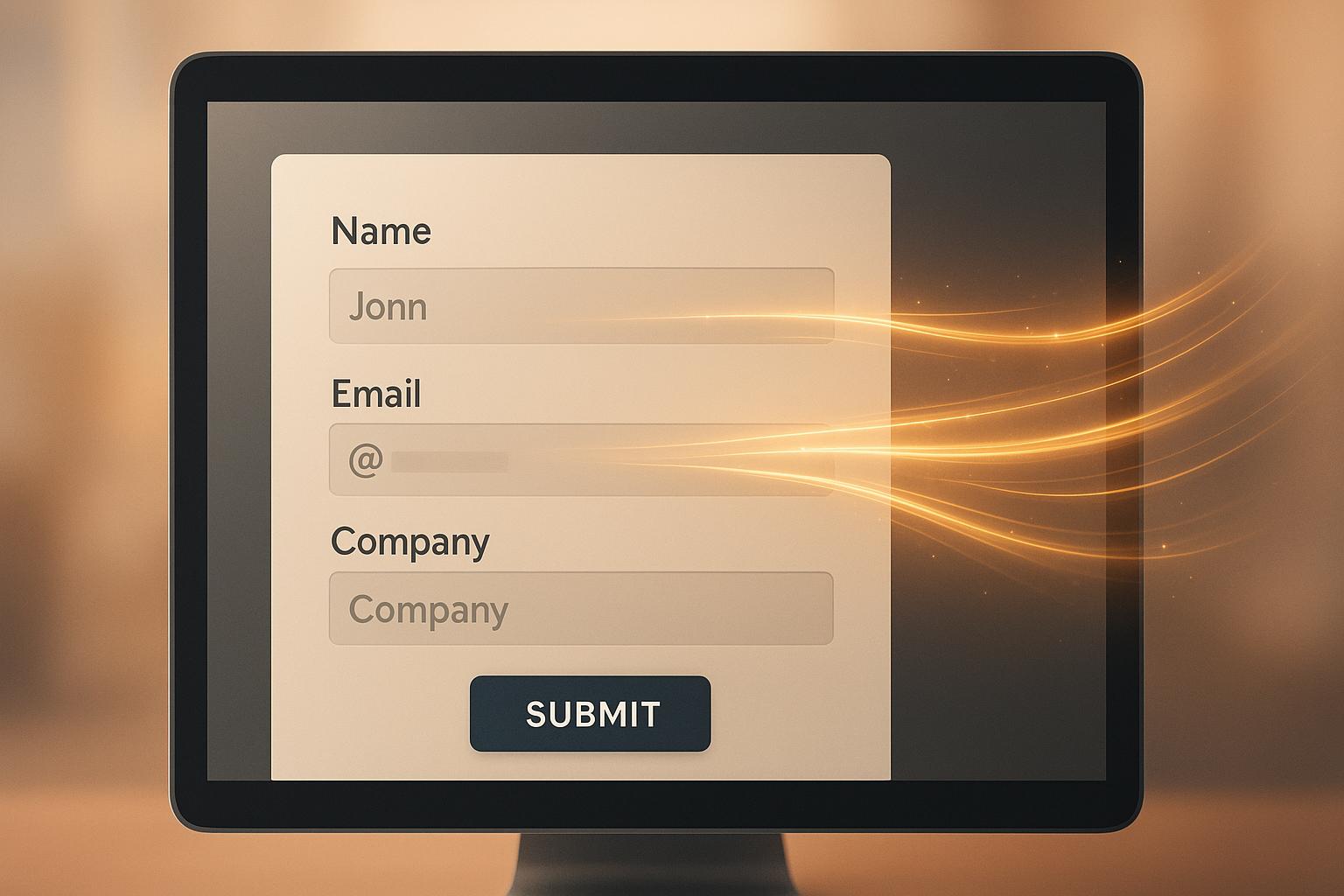
5. Capture Partial Form Data with MagicTag
Even the best-designed forms can't catch every visitor's input. Studies reveal that 19% of users are likely to return and finish a form if you reach out to them via email or phone to re-engage them. The problem? Traditional forms only save data when users hit "Submit", meaning any information entered by those who abandon midway is lost.
MagicTag changes the game by capturing user data in real-time as they type. It collects details like email, phone number, and name on the spot, then sends this information to your CRM through a webhook or API. This allows you to follow up with potential leads who didn’t complete the form.
"The distinguishing feature of Magic Checkout lies in its capability to furnish customer data at every checkout stage, furnishing e-commerce businesses with invaluable insights right from the outset." – Razorpay
The impact can be transformative. Studies show that monitoring forms can increase submissions by up to 50%. Capturing partial data doesn’t just help recover lost leads - it also builds a remarketing list of people who are clearly interested. You can use this data to send personalized follow-up emails, run retargeting campaigns, or have your sales team directly address any concerns to encourage form completion.
MagicTag is simple to use, works on any website, and doesn’t require a developer. It’s fully compliant with GDPR and LGPD regulations, integrates with your existing CRM, and provides a real-time dashboard for tracking leads. Businesses using MagicTag can identify up to 12x more leads than those without it. Plus, the free plan supports up to 1,000 identified users per month, making it an accessible option for businesses of all sizes to start recovering abandoned form data right away. These leads create a smooth pathway for recovery strategies, which we’ll dive into in later sections.
sbb-itb-77d5bc3
6. Use Exit-Intent Popups
Exit-intent technology is designed to detect when a user is about to leave your page. It works by monitoring actions like cursor movement on desktops and behaviors like tapping the back button or revealing the URL bar on mobile devices. This clever tool gives you one last chance to grab your visitor's attention and potentially turn their exit into a conversion.
One of the standout benefits of exit popups is their ability to capture valuable lead data right before a visitor leaves. In fact, they can boost conversions by an additional 2%–4%, with some reports showing increases as high as 46% and an average improvement of 11%.
The trick to making exit popups effective lies in offering something enticing and relevant. This could be a discount, free shipping, or even a simple email capture form. The key is to keep the message clear and focused on a single goal, ensuring it doesn’t overwhelm users who are already on their way out.
Take Shockbyte, for example. This OptinMonster client used exit popups to convert 13.73% of visitors who were about to leave. By implementing this strategy, they managed to double their sales conversions and achieved a staggering 10x business growth over three years.
For an even more powerful approach, combining exit popups with tools like MagicTag can make a big difference. MagicTag captures real-time data, so if a user starts filling out a form but doesn’t finish, an exit popup can step in to remind them of the benefits of completing it - or even offer a simpler way to stay connected. This seamless integration helps reduce form abandonment and keeps potential leads engaged.
7. Use Conversational Form Designs
Let’s face it - traditional forms can feel like a chore. They’re often long, overwhelming, and leave users frustrated. That’s where conversational forms come in. Instead of throwing all the questions at users in one go, these forms take a friendlier approach, presenting one question at a time. This simple shift helps reduce mental strain and keeps users from feeling stuck or indecisive. The results? Completion rates can jump by as much as 40% compared to standard forms.
The key to making conversational forms work is using natural, everyday language. Forget the stiff, formal tone. Instead of saying, "Enter email below", try something like, "What's your email address?" It’s more engaging and feels less robotic. You can even sprinkle in some personality - emojis or light humor can work wonders. For instance, push notifications with emojis have shown an 85% boost in open rates and a 9% increase in conversions.
Start with easy, non-sensitive questions like, "What should we call you?" Then, use conditional logic to adapt follow-up questions based on their responses. This approach not only makes the process feel tailored but also builds trust, making users more comfortable sharing their information.
Don’t forget to optimize for mobile users. Use large, easy-to-tap buttons and input types that match the data being collected (like "tel" for phone numbers). When it feels like a natural back-and-forth conversation rather than just another task, users are far more likely to complete the form.
8. Display Security and Privacy Badges
Visual cues play a big part in building trust and reducing form abandonment. One major reason users abandon forms is concern over data security. By including recognizable trust symbols - like SSL certificates or accepted payment icons - you can signal that your site is secure. These visual elements work hand-in-hand with other form improvements to reassure users at every step.
Research shows that trust badges can boost conversion rates by as much as 42% on e-commerce sites. When placed strategically near key areas, such as input fields or call-to-action buttons, they help users feel more confident about sharing their information. This added reassurance can make a significant difference during critical moments.
For extra impact, link these badges to official verification pages and include short, clear descriptions like "256-bit SSL secured" or "GDPR compliant" to further strengthen user trust.
9. Test Different Form Variations
Once you've optimized your form's design and user experience, the next step is to fine-tune it through testing. A/B testing is a powerful way to identify what resonates with your audience by relying on actual user behavior rather than assumptions or outdated trends.
Focus on testing one element at a time - whether it's the order of fields, the color of the button, or the wording of your call-to-action. For example, Microsoft once tested different headline formats on Bing, resulting in a 12% revenue increase within hours. This highlights how even small, targeted changes can lead to measurable improvements when variables are tested individually.
Experiment with button colors, as they can influence user emotions. Colors like orange or red might create a sense of urgency, while blue often conveys trust . Similarly, test variations in button text, like "Get Started", "Sign Up", or "Submit", to discover which phrasing drives more users to complete your form. To ensure reliable results, run each test for at least one to two weeks to achieve statistical significance .
Companies like Google and Microsoft conduct over 10,000 A/B tests annually. While you don't need to match that scale, consistency is crucial. Document each test with a clear hypothesis, track key metrics such as submission rates, and monitor secondary metrics like time spent on the page. Use these insights to guide future adjustments .
Keep in mind that only about 12% of design changes result in positive outcomes. Regular testing helps pinpoint changes that deliver results while avoiding updates that could harm performance.
10. Show the Benefits Before the Form
Let users know what's in it for them right away. Research shows that 30% of users are more likely to return and complete a form when they're offered something tangible, like a free tool or a discount. Headlines that focus on benefits - whether it's solving a problem, offering exclusive content, or saving money - immediately grab attention and set the tone.
"Your form is the closer. The visitor is looking at your website, your offer, and your form. They're considering filling it out. But the form itself owns the task of convincing them to follow through and actually do it. So give them a good reason to do so. Make an appealing, irresistible offer or incentive that takes away whatever resistance may still be holding them back - and include it in the form copy itself. That incentive is what will motivate them to follow through and complete the form, and not abandon it halfway." - Jen Swisher, Akismet
Make your value proposition clear and visible throughout the form. For example, instead of using a generic "Submit" button, try something more engaging like "Get My Free Guide." Add small bits of text (microcopy) to remind users of what they'll gain, such as "Enter your email for 10% off your first purchase." These small details help align user expectations with the actual benefits, encouraging them to complete the process without hesitation.
Transparency is just as important as incentives. If there are extra costs - like shipping fees, taxes, or subscription charges - make sure they're displayed early. Hidden fees are one of the top reasons people abandon forms. Similarly, prominently display your return and refund policies to build trust and address concerns before they arise. By being upfront about both the benefits and any potential costs, you create a seamless and trustworthy experience that encourages users to follow through.
Conclusion
Form abandonment doesn't have to spell the end of potential leads. The strategies outlined here tackle the core reasons users abandon forms - mistrust and frustration. By making forms simpler, improving the overall experience, and instilling confidence with visible security features and clear benefits, you can create a smoother process that encourages users to complete their journey.
Start by focusing on immediate, impactful adjustments. Prioritize basics like speeding up load times and adding trust badges to establish credibility. From there, roll out the other strategies incrementally over the next 2–3 months, giving your team and processes time to adjust.
And don’t forget: 19% of users may return if you re-engage them effectively. Using tools like MagicTag alongside these strategies helps you capture partial data, strengthening your lead recovery efforts. With MagicTag, you can ensure no potential lead slips through the cracks, making your follow-up efforts more effective.
FAQs
How does real-time validation help users complete forms?
Real-time validation makes filling out forms smoother by providing instant feedback on each field as users type. This immediate response allows users to correct errors on the spot, cutting down on frustration and creating a more seamless experience.
By addressing mistakes right away, users are far less likely to give up midway through. In fact, incorporating real-time validation can reduce form abandonment rates by up to 22%, making it an effective way to boost completion rates and improve conversions.
What makes conversational forms more effective than traditional forms?
Conversational forms are crafted to offer a more engaging, interactive experience than traditional forms. By imitating the flow of a natural conversation, they guide users step-by-step, making the process feel less overwhelming and boosting the chances of completion.
One standout feature is real-time validation, which checks the accuracy of user inputs as they progress. This personalized approach not only makes users feel more connected but also helps businesses see better results in lead generation and conversions. The outcome? Fewer abandoned forms and more reliable data to act on.
What are exit-intent popups, and how can they help reduce form abandonment?
Exit-intent popups are designed to detect when a user is about to leave a webpage and present a targeted message aimed at keeping them engaged. These popups can be especially useful in reducing form abandonment by offering incentives such as discounts, reminders, or personalized prompts to encourage users to complete the form before leaving.
By stepping in at the perfect moment, these popups address user hesitation or provide added value, making it more likely for visitors to stay and take action. This approach not only boosts form completion rates but also helps recover potential leads that might otherwise be lost.