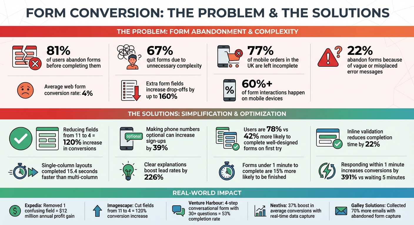
81% of users abandon forms before completing them. Why? Forms often ask for too much information, confuse users with poor design, and fail on mobile devices. Expedia once removed a single confusing field and gained $12 million in annual profit - proof that bad forms cost businesses big.
Here’s what’s wrong with most forms and how to fix them:
- Too many fields: Extra form fields overwhelm users, causing drop-offs to increase by up to 160%.
- Mobile issues: Over 60% of form interactions happen on mobile, yet many forms are hard to use on small screens.
- Confusing design: Poor layouts, vague error messages, and misplaced buttons frustrate users.
How to improve:
- Simplify forms: Fewer fields = higher completion rates. Example: Cutting fields from 11 to 4 boosted conversions by 120%.
- Go mobile-friendly: Use single-column layouts, larger buttons, and auto-fill features.
- Try conversational forms: Ask one question at a time to make forms feel easier.
- Capture partial data: Tools like MagicTag save user input even if they abandon the form, letting you follow up.
Your forms don’t need to be a barrier. Small changes can make a big difference - start by reducing friction and focusing on usability.
Form Optimization Statistics: How Field Reduction and Mobile Design Impact Conversion Rates
Fix Your Website Forms to Capture More Leads and Improve Conversion Rates
How Traditional Forms Reduce Your Conversion Rates
Traditional forms tend to frustrate users by asking for too much information, being poorly optimized for mobile devices, and featuring confusing designs. Let’s break down how these issues can hurt your conversion rates.
Too Many Form Fields Lead to Drop-Offs
Every extra field in a form makes users pause and question whether the effort is worth it. This hesitation often results in fewer completions. In fact, too many fields can create cognitive overload, causing abandonment rates to climb as much as 160%. This problem is even worse on mobile devices, where small screens make long forms feel overwhelming and difficult to complete.
"Web forms are essentially the definition of friction", says the editorial team at MarketingExperiments.
Poor Mobile Optimization
With over 60% of form interactions now happening on mobile devices, having forms that aren't mobile-friendly is a major problem. Yet, around 77% of mobile orders in the UK are left incomplete. Why? Traditional forms often make it unnecessarily hard for mobile users. Multi-column layouts force zooming, small buttons lead to accidental clicks, and manual keyboard switching for input fields adds frustration.
"If your form isn't mobile-optimised, you're losing half your audience before they even attempt to fill it out", warns Numen Technology.
CAPTCHAs are another roadblock, as deciphering distorted text or blurry images on a small screen discourages users, reducing conversions by about 3%. Forms without browser autofill or location-based autocomplete features further increase friction, making data entry more tedious and time-consuming.
Confusing Layouts and Unclear Instructions
Even if a form is mobile-friendly, poor design and unclear instructions can still drive users away. For instance, 22% of users abandon forms because of vague or misplaced error messages, while 67% quit due to unnecessary complexity.
Real-world examples highlight how small design flaws can have a big impact. The Transportation Security Administration’s web complaint form once placed a "Clear Form" button too close to the "Preview" button, leading users to accidentally delete their entries. Similarly, Netgear’s "Reset Password" form hid password requirements until after users failed to meet them, resulting in frustration and high abandonment rates.
Other common issues include disappearing placeholder text, which forces users to remember what they need to input, and multi-column layouts that slow users down by requiring them to constantly reorient themselves. Research shows that single-column forms are completed an average of 15.4 seconds faster than multi-column ones.
"It has been covered in general usability references... usability problems on forms really hurt business", notes Kathryn Whitenton from Nielsen Norman Group.
When forms follow basic usability principles, users are nearly twice as likely to complete them on the first try - 78% compared to 42%. Misaligned labels and vague error messages only add to the confusion, leading users to abandon forms after repeated failed attempts.
Modern Solutions to Improve Form Performance
Tackling issues like too many fields, poor mobile usability, and confusing layouts doesn’t have to be daunting. A few smart tweaks can significantly improve form completion rates and help you recapture missed leads.
Simplify Forms by Reducing Fields
The fewer fields your form has, the more likely users are to complete it. For example, Imagescape cut its form from 11 fields to just four and saw a whopping 120% increase in conversions.
Focus on collecting only the most essential details. Start with easy fields like name and email to ease users into the process. If you need a phone number, consider making it optional - forcing users to provide one can reduce sign-ups by as much as 39%. For forms with three or fewer options, swap dropdown menus for radio buttons to save clicks and speed things up. Another quick win? Stick to single-column layouts, which users complete an average of 15.4 seconds faster than multi-column designs.
Simplifying forms is just the start. Adding interactive and user-friendly elements can make the process even smoother.
Use Conversational Forms
Conversational forms take simplicity to the next level by turning form-filling into a more engaging experience. These forms ask one question at a time, mimicking a natural conversation. This approach reduces the mental effort involved and feels less overwhelming - especially on mobile devices where space is at a premium.
A great example comes from Venture Harbour, which used a four-step conversational form with over 30 questions. By breaking it into smaller chunks and adding progress indicators, they achieved a 53% completion rate. Using conditional logic to show only relevant questions based on previous answers also helps users avoid unnecessary steps. Plus, forms that take under a minute to complete are 15% more likely to be finished, and keeping each step to fewer than six questions can maintain completion rates above 50%.
Capture Data in Real-Time with MagicTag
Did you know that 81% of users abandon forms after starting them? Traditionally, all that data would be lost, but MagicTag changes the game. It captures key user details - like name, email, and phone number - as they type, even if they don’t hit the submit button. This means abandoned forms can still generate leads.
For instance, Nextiva saw a 37% boost in average conversions using this approach, while Galley Solutions collected 70% more emails. Acting on these leads quickly is crucial - responding within one minute can increase conversion rates by 391% compared to waiting five minutes. MagicTag is easy to integrate with CRMs using webhooks and APIs, doesn’t require a developer to set up, and complies with GDPR and LGPD standards. Even better, it’s free for up to 1,000 identified users per month, making it accessible to businesses of all sizes.
sbb-itb-77d5bc3
Optimize Forms for Mobile and Responsive Design
With mobile devices making up over 60% of all form interactions by 2025, failing to optimize for mobile can push users away. If your forms don’t function smoothly on smartphones and tablets, you risk losing a large chunk of potential conversions. Here’s how to create a seamless experience across devices.
Best Practices for Mobile-Optimized Forms
Mobile users engage with forms differently than desktop users, so your design needs to reflect these differences. A single-column layout is ideal - it aligns with natural scanning patterns and eliminates the need for horizontal scrolling. This not only simplifies navigation but also speeds up the process by reducing cognitive effort.
Designing for touch is just as important. Ensure buttons and input fields are at least 44px by 44px, with enough space around them to prevent accidental taps. Text input should be a minimum of 16px to avoid automatic zooming. For added convenience, use HTML5 input types like type="tel" and type="email", which trigger the appropriate keyboard for mobile users. This small adjustment saves time and frustration by eliminating the need to switch between keyboard modes.
Real-time feedback through inline validation is another must-have. Instead of waiting until users hit "submit" to flag errors, provide immediate feedback as they fill out each field. This can reduce completion times by an average of 22%. When designing for short lists, consider using radio buttons or segmented controls instead of dropdown menus. These options require fewer taps and are easier to navigate on smaller screens. By focusing on mobile-friendly design, you can make every interaction count toward higher conversions.
Responsive Design for All Devices
Responsive design builds on mobile-optimized principles to ensure a consistent experience across all devices. It’s more than just resizing elements to fit the screen - it dynamically adjusts images, text, and form elements to suit any device, whether it’s a smartphone, tablet, or desktop. This allows users to switch between devices effortlessly without losing functionality.
The impact is clear: forms designed with responsive principles are nearly twice as likely to be completed without errors on the first attempt - 78% compared to 42%. Considering that 81% of users abandon forms after starting them, reducing friction is critical.
As the Interaction Design Foundation states: "Responsive is not an option – do it. Everyone expects things to be mobile-optimized, and responsive just means that if I switch from my laptop to my tablet to my phone, the site's going to fit to that resolution".
Measure and Test Form Performance
Tracking your form's performance is essential for identifying problem areas and making improvements. With the average web form converting at just 4%, even small tweaks can significantly boost your lead capture.
Key Metrics to Track
Start with completion rate, which reveals the percentage of users who finish your form after starting it. To calculate this, divide the number of unique submissions by the total sessions or unique users. A low completion rate suggests friction in the process.
Next, monitor the abandonment rate, which shows how many users begin your form but don’t finish. On average, 81% of users abandon forms mid-way. To dig deeper, track field-level drop-off to pinpoint where users give up. For example, if most users quit at the phone number field, you’ve likely found a key issue.
Time to complete is another critical metric. Forms completed in under one minute experience a 15% higher completion rate. If your form takes longer, it could mean users find it confusing or overly demanding. Lastly, assess lead quality - the percentage of submissions that meet your ideal customer profile. A high completion rate is meaningless if the leads aren’t valuable.
Once you’ve defined these metrics, you can use A/B testing to refine your forms even further.
Use A/B Testing to Optimize Forms
A/B testing takes the guesswork out of form optimization. Start by experimenting with your call-to-action text. Use benefit-focused phrases like "Get My Custom Quote" or "Download My Free Guide." Then, test layout changes, such as switching to a single-column design, which has been shown to speed up completion by 15.4 seconds. For instance, when Expedia removed a single confusing field, they added $12 million to their annual profit.
For more complex forms, consider breaking them into multi-step sequences. Venture Harbour, for example, turned a lengthy 30-question application into a four-step process with progress indicators and achieved a 53% conversion rate. The secret is to test one variable at a time so you can clearly identify what’s driving the improvements. Focus on the areas where your analytics show users are struggling the most, and address those friction points first.
Conclusion
Your forms play a pivotal role in either winning over customers or driving them away. High abandonment rates and low conversion averages highlight how much poorly designed forms can hurt your business. Things like too many fields, confusing layouts, or designs that don’t work well on mobile devices can quickly turn potential leads into missed opportunities.
Here’s the good news: small tweaks can lead to massive improvements. For example, cutting the number of form fields from 11 to 4 can increase conversions by 120%. Adding clear explanations? That can boost lead rates by an impressive 226%. These aren’t just theories - they’re proven strategies used by companies like Expedia and Imagescape to drive real revenue growth.
Tools like MagicTag can help you take it a step further by capturing real-time data from abandoned forms, giving you a second chance to engage with potential leads. Pair that with conversational layouts, mobile-first designs, and ongoing A/B testing, and your forms can go from being obstacles to becoming powerful lead generators.
Now’s the time to take action. Start by auditing your current forms. Are there unnecessary fields you can eliminate? Could a multi-step layout make the process feel simpler? Is your design optimized for mobile users, who now account for over 60% of interactions? Pay close attention to metrics like completion rates and abandonment points, and use that data to refine and improve.
The bottom line? Effective forms don’t happen by accident. They require thoughtful design, consistent testing, and a focus on the user experience. Your next customer is already on your form - make sure they have an easy path to completing it.
FAQs
How does reducing the number of form fields help increase conversions?
Reducing the number of form fields makes the process quicker and more user-friendly. When a form feels simple and manageable, visitors are more likely to complete it, which can lead to higher submission rates and better conversions.
Cutting out unnecessary fields not only minimizes frustration but also shortens the time needed to fill out the form. This streamlined approach creates a seamless experience, encouraging more people to stay engaged and finish the task.
How can conversational forms improve my website's conversion rates?
Conversational forms turn the traditional, static form-filling process into an interactive, one-on-one experience. Instead of overwhelming users with a long list of fields, these forms present questions one at a time, making the process feel more natural and manageable. This focused approach often leads to higher completion rates and longer user engagement.
Designed with mobile users in mind, conversational forms include features like autofill and smart suggestions, making data entry on smaller screens much easier. They can also incorporate personalized elements like dynamic branching (showing only relevant questions) or contextual hints, which help build trust and reduce the chances of users abandoning the form. Businesses that switch to conversational forms frequently report conversion rate boosts ranging from 20% to 40%, thanks to this user-friendly design.
How does MagicTag collect data from incomplete or abandoned forms?
MagicTag employs cutting-edge tracking tools to gather data from forms, even when users abandon them without hitting "submit." This means businesses can retrieve important details that might have been lost due to incomplete submissions. By securely saving partially entered information, MagicTag enables companies to reconnect with potential leads and refine their strategies to boost conversions.
And don’t worry - MagicTag adheres to strict privacy standards, ensuring all user data is managed responsibly and securely.